Image Requirements are used as a guideline for client-generated content uploaded to our CMS and Management Center systems.
These guidelines may be useful in the process of creating:
- Items
- Combos
- Modifiers
- Discounts
- News
- Store Images
Those images are displayed in Mobile App, Web App, and Kiosk.
Items
Item images help users navigate through the Menu and help you give the best representation of your Items.
One Item can only have one image. It is displayed in multiple places across the ecosystem and it may be cropped depending on where the Item is being displayed.
These guidelines will help you position the image correctly.
DO:
- Use background in white or color to make the visuals stand out
- Use a professional photographer if you can
DON’T:
- Use the text on images
Our research shows that the majority of Users appreciate good looking images, and use it in decision making and a significant percentage of users base their decision solely on the displayed image.
Image requirements:
- Image size: 1200x800px
- Maximum image weight: 800 KB
Visible area:
- Menu and Subcategory screen - 800x800px
- Item screen - visible part on phones with notch: 1200x700px
Combos
In our system, combo images are used to represent bundled products. The image should depict the main Combo Item as well as the available sides. The combo image can be displayed on the Menu screen, the Subcategory screen, when upselling and/or customizing a combo. In different contexts, the image is going to be cropped. One Item can only have one image.
These guidelines will help you position the image correctly.
DO:
- Use background in white or color to make the visuals stand out
- Use a professional photographer if you can
- Select carefully which Items you’ll show together with the main Item in Combo.
- Show default Items in the Combo image
Our research shows that 92% of Users expect to get what is seen in the image. Also, 36% of Users assume that they’ll be able to make a custom selection of Items in a Combo.
DON'T:
- Show Items that aren’t in Combo
- Show Items in a group where only one can be selected
- Use the text on images
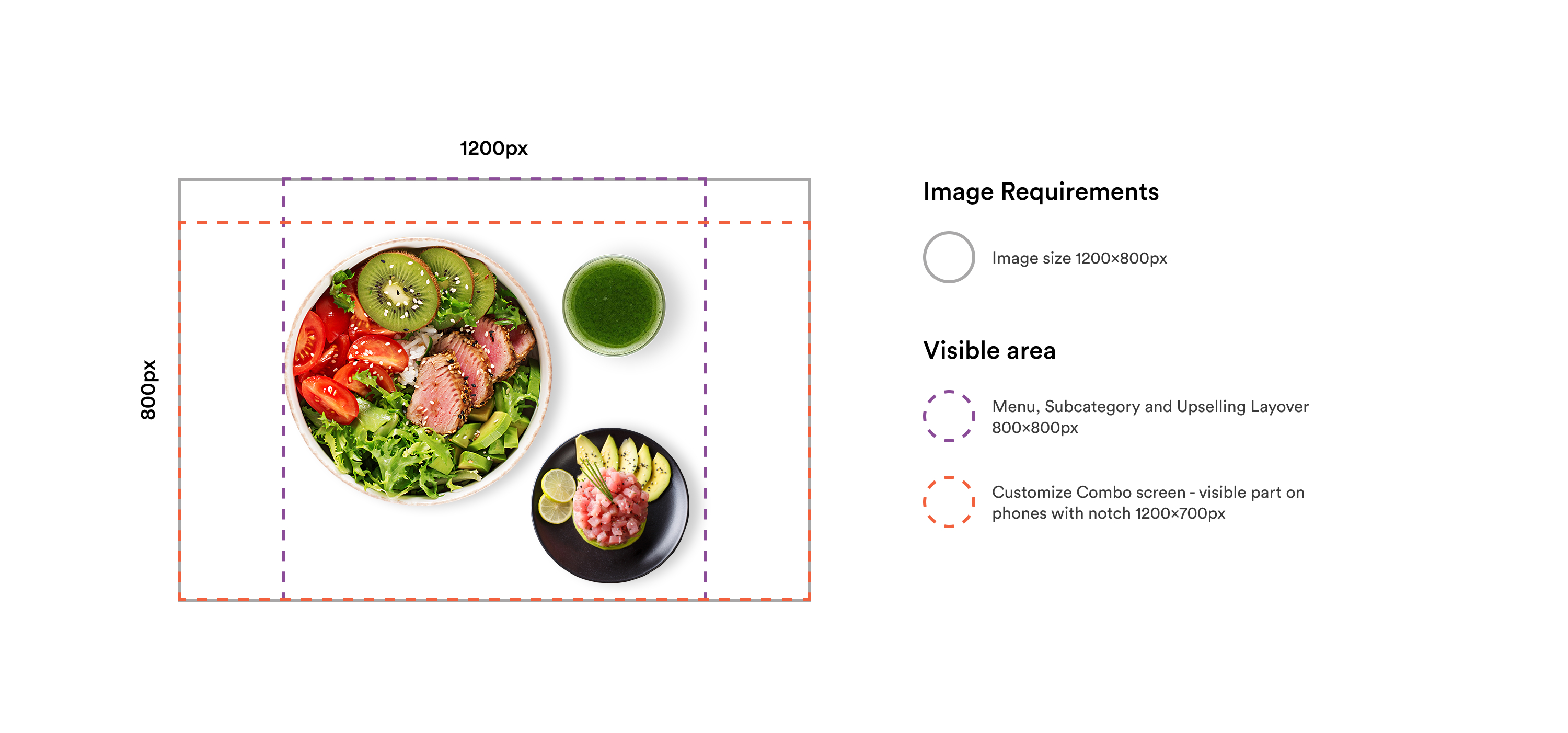
Combo Clusters
Combo Cluster represents a "container" for Combos and Items to be combined into a separate Combo Meal. Multiple Combos can be assigned to one Combo Cluster.
Combo Cluster images help with up-selling and customizing. The image should show Combo Meal and the Main Item and/or any other Item that is in the Cluster.
The same Image requirements for Combos apply to Combo Clusters.
Image requirements:
- Image size: 1200x800px
- Maximum image weight: 800 KB
Visible area:
- Menu, Subcategory and Upselling Layover - 800x800px
- Customize Combo screen - visible part on phones with notch: 1200x700px
 Modifiers
Modifiers are modifications or add-ons ordered as part of an Item. Images should represent a single Modifier and help users scan through the list of Modifiers and perform a quick selection. Good visual representation of Modifiers improves User’s ordering experience.
Modifiers should be single add-ons like:
- Toppings
- Spices
- Additional ingredients
- Full Items
Use these guidelines to correctly position Modifiers in a Modifier Image.
DO:
- Modifier Images should have a white background for a User to be able to scan quickly through possible Modifiers
DON’T:
- Use the text on images
Image requirements:
- Image size: 1200x800px
- Maximum image weight: 800 KB
Visible area:
- Item screen: 800x800px
Discounts (Coupons, Promotions, and Rewards)
Your app may have Offers (Coupons and Promotions) and Rewards, and their images should follow the same set of guidelines. One image represents the Discount in all the places where the Discount is displayed (in the list of all available Discounts and the Discount preview or editing section).
Use guidelines to correctly position elements of the Discount in the Discount Image.
DO:
- Feature Items and Combos that the Discount applies to
- Use background color to make the discount look richer
- Use text for Discount images if needed: the text should emphasize the value of the Discount for the User (e.g. the prize or the Discount amount)
- Place text inside a safe area (check the details below)
DON'T:
- Overlap the text and Items in Discount Images as it reduces readability
- Use a small text size on Discount images: It needs to be readable in the list of Discounts where the Image is shown in a smaller format
- Include a disclaimer text in an image unless specifically advised by your counsel: Discount preview screen has a designated area that can include a legal disclaimer text
- Place text below the close button or the notch area (check the details below)
Image requirements:
- Image size: 1200x800px
- Maximum image weight: 800 KB
Visible area:
- Offer/Reward screen: 1200x800px
- Offer/Reward preview - visible part on phones with notch: 1200x700px
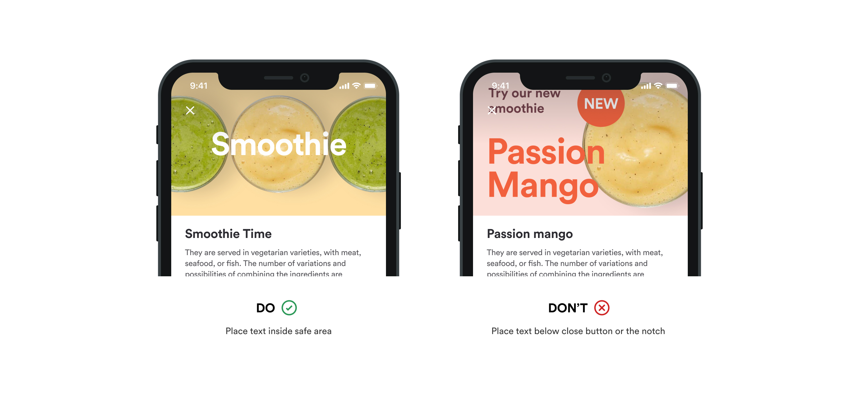
Text safe area:
- Under close button: 1200x480px
- Under the notch area and right of the close button: 930x615px
News
News images visually summarize topics of News articles. Articles are displayed in the form of a list with the image in the article header.
Use these guidelines to correctly position elements in a News article image.
DO:
- Visually saturated graphic, colorful and features a text snippet from the article
- Place text inside a safe area (check the details below)
DON'T:
- Use white background for News images
- Place text below the close button or the notch (check the details below)
Our research shows that users are highly interested in the News about the Offers, Campaigns and new Items, which provides a direct benefit to them. They don’t engage in corporate News.
Image requirements:
- Image size: 1200x800px
- Maximum image weight: 800 KB
Visible area:
- Home and News screen: 1200x800px
- News article - visible part on phones with notch: 1200x700px
Text safe area:
- Under close button: 1200x480px
- Under the notch area and right of the close button: 930x615px
 Store Image
You have the option of adding a store image for each of your stores. This image is important if you are using our web app. One Item can only have one image.
Use these guidelines to correctly create a Store image.
DON'T:
- Use the text on images
Image requirements:
- Image size: 1200x800px
- Maximum image weight: 800 KB
Visible area:
- Web App Menu Screen: 1200x800px
- Status Screen and Receipts: 800x800px
- Mobile Store Info Screen: 1200x700px
Gift Card Image
The goal of the gift card is to generate additional revenue for brands through gift card sales and reloads, and improve the payment experience for customers by offering an additional payment method.
You have the option of adding a gift card image.
Use these guidelines to correctly create a Gift card image.
DON'T:
- Use the text on images
Image requirements:
- Image size: 1200x800px
- Maximum image weight: 800 KB
Visible area:
- Web App detail Screen: 1200x800px
- Mobile App detail Screen: 1200x800px
Text Safe area:
- Displayed only on "My cards" component: 1200x480px
Comments
0 comments
Please sign in to leave a comment.